

1. In what ways does your media product use, develop or challenge forms and conventions of real products? 


*My magazine utilises conventions of typical music magazine products by:
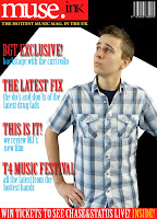
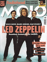
- Using a male model on the front cover, similar to products such as ‘Mojo’ and ‘Uncut’.
- The model is posed in a position that shows attitude and power. This is done by having him with his hands on his hips and having him looking up at the title; As opposed to the sexualised pose of female models like on the magazine mentioned in Research Continued..
- Having the male model posed in such a way gives connotations that the magazine itself if rebellious and powerful, much like ‘Kerrang’ magazine, who usually has their models filling the entire front cover.
- The model is wearing ordinary clothes so the audience can feel like they have more of a chance to look like and be like him, thus making him more likeable.
- The title of my magazine has been put into a block, which is generally unusual, unless you look at ‘Q’ magazine. The block for ‘Q’ is usually hidden partially by the model but in some issues they don’t follow conventions by having their block totally seen, which is what I’ve done with my front cover.


- The contents page of my magazine is partly based on the one in ‘Q’, because it relates to my target audience.
- The colour scheme runs the same as the front cover, which follows the usual conventions of media products and helps to create a house style.
- If you compare the contents of ‘Q’ you can clearly see where I got my inspiration from, even though my contents piece doesn’t look the same as ‘Q’s.
- One of the differences that I made to my contents page was to add a competition section onto the piece. I got this idea from ‘NME’ magazine, as they have promotional offers in their contents pages.
- I’ve added my own twist to this by using a competition piece instead of having promotional offers, which allows to audience to have a sense of ownership over the magazine.
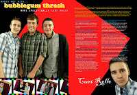
- The pictures at the side of the features section have been edited into the shape of a circle, this challenges conventions slightly as they normally are positioned to fit the whole page are put at thumbnails in bigger groups.


- Using columns in my article is a convention that is almost always used in all magazines.
- It's a double page spread, therefore fits onto an A3 sheet of paper.
- The picture of the band who the article is about is placed on the left hand side to the article, this is quite a typical feature of magazine articles.
- I’ve also kind of gone against traditional magazine features by having the picture edited onto the background of the article. If you compare this to ‘NME’ articles you see that the background of the photo is used at the background of the page.
- It’s in the style of an interview, with the actual word for word interview that took place as the piece. This now becoming an increasingly popular style as it makes the magazine seem more rebellious when including expletives from the interviewee.
2. How does your media product represent of a social group?
My product represents my target social group by:
- Having a male model on the front cover dressed in a similar fashion to the way my target audience would dress.
- I’ve used colloquial language in the article and contents page to show the rebellious side to the magazine and also to bring the magazine down to earth more.
- The music genre of the magazine is Indie/Rock so it appeals the that type of social group and has pieces in the magazines about bands specific to that genre. (E.g Florence and the Machine, Lady Gaga, Oasis etc..)
- It also presents this social group in a positive light, even although it has a piece in about drugs, this piece is to advice the audience on which ones are safer to take if taking any.
- The competition in the magazine is to win tickets to a gig, and the social group my magazine is aimed at is typically full of younger people who go to gigs on a regular basis, so it provides an opportunity to help do their hobby.
- I've also added a personal touch to the article of my product by adding a signature from the artist onto it, this appeals more to my audience because it, again, brings the magazine down to earth and the target audience will not want to buy a magazine that comes across as being arrogant and posh.
- The artist included in my article also comes across as an ordinary lad who's become famous and hasn't really changed and let it go to his head, this gives the audience a sense that they can also become famous and be like him.
3. What kind of media institution might buy your magazine?
* Bauer media company would potentially buy my product because if we look at the website we can see that they already have ‘Q’ as part of their marketing. My product is heavily linked with ‘Q’ as it has played a huge part in the roll of the layout and how it has been set up. As there is already magazines in Bauer that are a similar style to mine, it means that I can present a new, unique angle on the way that they have presented the same social groups as I have. Bauer are a well recognised company and would greatly aid the distribution of my product. The magazines currently being produced by Bauer are magazines like ‘Q’, ‘Mojo’, ‘KERRANG!’ and my magazine would fit in perfectly alongside these brands on the shelves, so it provides a wider demographic for Bauer to produce magazines for, therefore profiting them.
4. Who would be the audience for your media product and how did you attract them?
My target audience profile: 
- Older teenage audience, age range 16-25.
- Disposable income to spend on things like gigs and also this magazine. This magazine would be £2 and produced bi-weekly.
- Overt interest in music and fashion.
- Active social life, meaning the magazine would have to be shorter and quicker to read, so my magazine is slightly shorter than some other magazines (E.g ‘Q’ and ‘KERRANG!’) but this makes it better for my target audience.
- My target audience has a slight rebellious attitude and my magazine reflects this in the bands used and also by using things like colloquial language and clashing colours (black and white).- Alot of the pictures used in my magazine don't look like they've been taken deliberately. E.g the models aren't really posing. This is a good way of getting the attention of my target audience, in particular the males, as they would think posing for a photo is completely stupid and vain, even although they themselves are quite vain without taking photos.
5. What have you learned about new technologies from the process of constructing this product?
*By constructing this product I have learned:
- How to cut out images with finer success.
- How to change the colour (shadows and lighting) of images. (Right: Before, Left: After)
- I’ve became more confident when taking photos and making the clearer when initially taking them as opposed to editing it later.
- I've also learnt how to airbrush the image to make everything look finer and smoother.*I’ve also learned skills that don’t involve photoshop:
- I’ve learned how to properly set up and write a blog and learned more about HTML.
- I’ve learned about different camera angles and the positioning of the camera to convey different messages of the subject to the audience.
- Blogs can present a wider audience of millions of people via the web and therefore presents us with the opportunity to get our voices heard by the public.

6. Looking back at your preliminary task, what do you feel you have learned in the progression from it to the full production?
*The preliminary task has shown me that:
- The market research plays a MASSIVE role in the making and production of media products so you can give the customers exactly what they want. ( See Questionaire. )
- Simpler is definitely better. For example when doing my front cover I originally tried to put too many effects on the fonts. And also when making the contents a single page was definitely better than a double.
- Colour schemes are highly important, I now don’t like the colours in my prelim task, so you need to be careful when selecting colours to match and sell.
- I learned lots more technical skills to use for future media products.
- Content is also highly important as this will attract the audience that you want.
