
Connie Lim
JayM.
Wednesday, 1 December 2010
Complications..
Well this typical english weather seems to be getting in the way of filming at the moment. With schools closing and transport becoming increasingly difficult to get a hold of, filming is becoming more and more of a hard job. So for now, please enjoy our storyboards for the project and please restrain yourself from commenting on the quality of the drawing.. Amazing though it may be.. (:

Wednesday, 3 November 2010
Beginning of Filming..
First Day Of Filming: 01.11.2010 Just a quick video explaining what happened on our first day of filming (: Enjoy!
Wednesday, 20 October 2010
Getting Started..
The main issue of the day is to get permission to film in our different locations. More specifically, places like Newcastle Airport & Fenwick's, we would have to email or phone well ahead of time to make sure that we would be allowed to film. Having already been in touch with Newcastle Airport (N.A) & Fenwick's, we've discovered that we cannot film in one of the locations (Fenwick's) because of the time of year it is. With them having to put up the famous window and also with over eager christmas shoppers trying to get all of their presents before december it would be far too busy for even our small camera crew to be in the way. N.A have been in touch, but nothing is yet confirmed. Cenrtal Station is a good alternative to N.A however we are having difficulty finding contact details for their head office at the moment to ask for filming permission. The other locations, are public. Therefore providing its not hideously busy (which on Northumberland Street, chances are it's going to be, but we kind of want that!) We can film easily without really needing to ask anyones permission to do so. Making our lives a lot easier. Happy days! (:
Wednesday, 13 October 2010
Location Shots
For the locations, we've decided to stay quite local, with the furthest we're going to travel to being South Shields. We went out and got some location shots so we could get a rough idea of where we could film different scenes and shots for our video. The following shots were taken in Newcastle city centre (The best place to be!) (:

This first shot was taken by the flats behind Black Friar's near China town (behind the Gate for anyone who is geographically incapable like myself). We decided this looked like a really nice, cute place to film some romantic memory scenes. Maybe some shots of the couple walking through past the flats to show where they live. It looks like a quiet little village somewhere: A very romantic setting for any young couple to fall in love (:

This area is just across from the picture above. Its a small park, where we though the couple could be filmed having a picnic or a cup of coffee. Again another memory shot for the video. The area is all natural with natural colouring, so it would make the scenes look a lot more real but the green colouring and the older looking buildings give a more 'homey' effect to the shot.

Coffee shops are a typical place for romance to happen. Even if it's a break up coffee or a get together coffee it still is a good place for sparks to ignite (: Again this is more for the memory shots than anything else, but we think that coffee shops are perfect for this part (even if we end up not using Starbucks).

We've decided for the chase scene (or at least one of them) we would have the girl going down onto the metro to get on and get try and to the airport/train station before the boy goes. The metro is the easiest option in terms of filming on public transport as we dont actually have to film her on the metro just film her getting onto it. Easy done!

This first shot was taken by the flats behind Black Friar's near China town (behind the Gate for anyone who is geographically incapable like myself). We decided this looked like a really nice, cute place to film some romantic memory scenes. Maybe some shots of the couple walking through past the flats to show where they live. It looks like a quiet little village somewhere: A very romantic setting for any young couple to fall in love (:

This area is just across from the picture above. Its a small park, where we though the couple could be filmed having a picnic or a cup of coffee. Again another memory shot for the video. The area is all natural with natural colouring, so it would make the scenes look a lot more real but the green colouring and the older looking buildings give a more 'homey' effect to the shot.
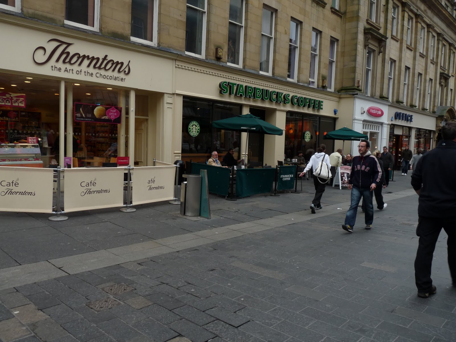
Coffee shops are a typical place for romance to happen. Even if it's a break up coffee or a get together coffee it still is a good place for sparks to ignite (: Again this is more for the memory shots than anything else, but we think that coffee shops are perfect for this part (even if we end up not using Starbucks).

We've decided for the chase scene (or at least one of them) we would have the girl going down onto the metro to get on and get try and to the airport/train station before the boy goes. The metro is the easiest option in terms of filming on public transport as we dont actually have to film her on the metro just film her getting onto it. Easy done!
Monday, 4 October 2010
Research into Music Videos
As acting director I decided to do some research on music videos, looking at the way they've been filmed & also looking at the typical plot line. I've mainly looked at David Guetta videos, so I can keep in the same style to make it look more realistic and professional.
David Guetta - Kid Cudi - Memories (Featuring Kid Cudi)
Looking at this video by Guetta (Directed by Keith Schofield) from first glance it doesn't really look like the typical video of the artist (or at least at the beginning). 9 out of 10 of Guetta's videos have gorgeous women starring in it, or at least looking very sexualised throughout. You see this a lot when looking at music videos in general because the sexualised woman appeals to both genders in that men fancy her and women wish they could be her.
However this video plays a little trick because if you look closer at the camera following Kid Cudi on his journey to the party, you can see that the entire camera crew is composed of naked beautiful women with words (added in graphically) covering their modesty.
Guetta's music videos tend to be based around partying and living the typical rockstar/Dj lifestyle of simply having a good time. This video is the prime example of this. The entire video is centered around a party. This is probably largely to do with the fact that the song itself is talking about going out and getting absolutely wasted. Right at the end of the video we see a very typical scene in Guetta's videos which is the big party scene at the climax of the song.
Magnetic Man ft Katy B - Perfect Stranger
The difference with this music video (directed by WIZ (who does lots of music videos)) is that the plot of the video seems to be quite hard to understand, or at least from a personal point of view. The song itself is about meeting the 'Perfect Stranger' and instantly connecting with someone who you've just met. However the video seems to be presenting the idea of a rebellion in a rural city and the fire department are there to try and calm everything down.
The video is filmed mainly using black & white, and idea we're thinking of using in our own video for the memory scenes to show nostalgia. There are lots of slow motion shots used in this video as well, like for example when Katy B (the singer) is being chased by one of the fire brigade. The slow motion really adds emphasis on all of the emotion to the chase; The fear of her being caught is really accentuated through the slow motion, which really adds an interesting effect to the video. We could also use this in our video to show the devastation of the girl missing the train/plane or even or even to show the amount of love between the couple.
Chase & Status - Pieces Remix
The hand held camera used in this video really adds a good effect to the entire piece. The song is about brwaking up with someone who never really cared about you but won't let it go.
The video matches the song perfectly, in my opinion. The idea of it being filmed in night vision adds to the thought of it being forbidden and that she's not supposed to be there, as though its a security video. The trashing of the flat is filmed in a very skillful way, in that it manages so show everything that is happening without seeming like it's an actual homemade video. All the camera movements are very smooth and any edits are done with good precision and look good for the type of video that it is. Personally, my favourite part is when the singer is walking up the street and the cuts have gave an excellent effect on his face and the way the street is lit etc..
Willow - Whip My Hair
Because the artist in this video is so young, the video itself is fairly innocent and simple. The song is literally what it says on the tin, and is about whipping your hair back and forth!
With Willow having a famous Dad (Will Smith), it means she's more likely to have a larger budget to have more dancers and effects and you can she that this has been used to her advantage. Throughout the video she has a wide range of insane hairstyles (which I positively ADORE!) and her costumes are very wild and stylish. This compliments her age but also adds to the effect of the song as well.
Year 13 Video Project: Introduction
Our group decided for our video project to do a music video for the song When Love Takes Over - David Guetta ft. Kelly Rowland.
In the group we each allocated ourselves a job to be in charge of during the filming process:
Joss (Myself):
- Directing
- Acting
- Continuity
- Costume, make up & Props
Soph:
- Storyboard
- Editing
- Location
- Filming
The storyline we've decided to go with for the video is very simple and follows the typical conventions of a romantic film/music video. The idea is that a couple, who are in their late teens ( with the girl being played by yours truly (: ) and who are also very much in love. The boy then finds out that he has to move away to a different country and there's nothing the girl can do about it. After a lot of upset and nostalgic thinking the girl becomes convinced ( by the boy's best friend )to chase after the boy, only to find when she gets to the airport that she's missed his flight. And just when you think it's all over.. ta-da! Boy appears at the top of the stairs, they hug & kiss and live happily ever after. Very romantic and very soppy (:
I decided to put myself forward to be director & actor because it would make it easier to work with myself and know exactly what I want from the offset, rather than having to explain to another actor, thus making it quicker & more effecient to make the video.
Wednesday, 5 May 2010
Audience Comments
I showed my work to a number of different potential audience members for my piece and these are some of the feedback comments made:
Alysha, 16: I really like this piece! It looks real and the type of magazine I would buy, its very professional!
Laura, 17: I love how it's mature looking, and the juicy gossip on the front cover isn't overloaded. It's very unique and that's what I like! (:
Andrew, 19; The colours of the magazine make it look like a real unisex product. Like both boys and girls can enjoy it from the look of it, and the topics are something that everyone can enjoy! Very realistic.
Dean, 18; I think the magazine would definitely be seen on the shelves next to something like KERRANG! or Q or anything like that. Definitely a magazine I would spend money on! (:
Monday, 15 March 2010
Evaluation


1. In what ways does your media product use, develop or challenge forms and conventions of real products? 


*My magazine utilises conventions of typical music magazine products by:
- Using a male model on the front cover, similar to products such as ‘Mojo’ and ‘Uncut’.
- The model is posed in a position that shows attitude and power. This is done by having him with his hands on his hips and having him looking up at the title; As opposed to the sexualised pose of female models like on the magazine mentioned in Research Continued..
- Having the male model posed in such a way gives connotations that the magazine itself if rebellious and powerful, much like ‘Kerrang’ magazine, who usually has their models filling the entire front cover.
- The model is wearing ordinary clothes so the audience can feel like they have more of a chance to look like and be like him, thus making him more likeable.
- The title of my magazine has been put into a block, which is generally unusual, unless you look at ‘Q’ magazine. The block for ‘Q’ is usually hidden partially by the model but in some issues they don’t follow conventions by having their block totally seen, which is what I’ve done with my front cover.


- The contents page of my magazine is partly based on the one in ‘Q’, because it relates to my target audience.
- The colour scheme runs the same as the front cover, which follows the usual conventions of media products and helps to create a house style.
- If you compare the contents of ‘Q’ you can clearly see where I got my inspiration from, even though my contents piece doesn’t look the same as ‘Q’s.
- One of the differences that I made to my contents page was to add a competition section onto the piece. I got this idea from ‘NME’ magazine, as they have promotional offers in their contents pages.
- I’ve added my own twist to this by using a competition piece instead of having promotional offers, which allows to audience to have a sense of ownership over the magazine.
- The pictures at the side of the features section have been edited into the shape of a circle, this challenges conventions slightly as they normally are positioned to fit the whole page are put at thumbnails in bigger groups.


- Using columns in my article is a convention that is almost always used in all magazines.
- It's a double page spread, therefore fits onto an A3 sheet of paper.
- The picture of the band who the article is about is placed on the left hand side to the article, this is quite a typical feature of magazine articles.
- I’ve also kind of gone against traditional magazine features by having the picture edited onto the background of the article. If you compare this to ‘NME’ articles you see that the background of the photo is used at the background of the page.
- It’s in the style of an interview, with the actual word for word interview that took place as the piece. This now becoming an increasingly popular style as it makes the magazine seem more rebellious when including expletives from the interviewee.
2. How does your media product represent of a social group?
My product represents my target social group by:
- Having a male model on the front cover dressed in a similar fashion to the way my target audience would dress.
- I’ve used colloquial language in the article and contents page to show the rebellious side to the magazine and also to bring the magazine down to earth more.
- The music genre of the magazine is Indie/Rock so it appeals the that type of social group and has pieces in the magazines about bands specific to that genre. (E.g Florence and the Machine, Lady Gaga, Oasis etc..)
- It also presents this social group in a positive light, even although it has a piece in about drugs, this piece is to advice the audience on which ones are safer to take if taking any.
- The competition in the magazine is to win tickets to a gig, and the social group my magazine is aimed at is typically full of younger people who go to gigs on a regular basis, so it provides an opportunity to help do their hobby.
- I've also added a personal touch to the article of my product by adding a signature from the artist onto it, this appeals more to my audience because it, again, brings the magazine down to earth and the target audience will not want to buy a magazine that comes across as being arrogant and posh.
- The artist included in my article also comes across as an ordinary lad who's become famous and hasn't really changed and let it go to his head, this gives the audience a sense that they can also become famous and be like him.
3. What kind of media institution might buy your magazine?
* Bauer media company would potentially buy my product because if we look at the website we can see that they already have ‘Q’ as part of their marketing. My product is heavily linked with ‘Q’ as it has played a huge part in the roll of the layout and how it has been set up. As there is already magazines in Bauer that are a similar style to mine, it means that I can present a new, unique angle on the way that they have presented the same social groups as I have. Bauer are a well recognised company and would greatly aid the distribution of my product. The magazines currently being produced by Bauer are magazines like ‘Q’, ‘Mojo’, ‘KERRANG!’ and my magazine would fit in perfectly alongside these brands on the shelves, so it provides a wider demographic for Bauer to produce magazines for, therefore profiting them.
4. Who would be the audience for your media product and how did you attract them?
My target audience profile: 
- Older teenage audience, age range 16-25.
- Disposable income to spend on things like gigs and also this magazine. This magazine would be £2 and produced bi-weekly.
- Overt interest in music and fashion.
- Active social life, meaning the magazine would have to be shorter and quicker to read, so my magazine is slightly shorter than some other magazines (E.g ‘Q’ and ‘KERRANG!’) but this makes it better for my target audience.
- My target audience has a slight rebellious attitude and my magazine reflects this in the bands used and also by using things like colloquial language and clashing colours (black and white).- Alot of the pictures used in my magazine don't look like they've been taken deliberately. E.g the models aren't really posing. This is a good way of getting the attention of my target audience, in particular the males, as they would think posing for a photo is completely stupid and vain, even although they themselves are quite vain without taking photos.
5. What have you learned about new technologies from the process of constructing this product?
*By constructing this product I have learned:
- How to cut out images with finer success.
- How to change the colour (shadows and lighting) of images. (Right: Before, Left: After)
- I’ve became more confident when taking photos and making the clearer when initially taking them as opposed to editing it later.
- I've also learnt how to airbrush the image to make everything look finer and smoother.*I’ve also learned skills that don’t involve photoshop:
- I’ve learned how to properly set up and write a blog and learned more about HTML.
- I’ve learned about different camera angles and the positioning of the camera to convey different messages of the subject to the audience.
- Blogs can present a wider audience of millions of people via the web and therefore presents us with the opportunity to get our voices heard by the public.


6. Looking back at your preliminary task, what do you feel you have learned in the progression from it to the full production?
*The preliminary task has shown me that:
- The market research plays a MASSIVE role in the making and production of media products so you can give the customers exactly what they want. ( See Questionaire. )
- Simpler is definitely better. For example when doing my front cover I originally tried to put too many effects on the fonts. And also when making the contents a single page was definitely better than a double.
- Colour schemes are highly important, I now don’t like the colours in my prelim task, so you need to be careful when selecting colours to match and sell.
- I learned lots more technical skills to use for future media products.
- Content is also highly important as this will attract the audience that you want.
Wednesday, 27 January 2010
Article


- This is the first take of my article. As you can see there are quite a few problems with this.
- Immediately, you can see there is a HUGE space underneath the title and the first part of the article (circled in white in case you missed it). I had planned on filling this gap in but it became to be a bigger problem as the original plan of getting a picture of a tour bus wasn't really possible as, unfortunately, I do not own my own personal tour bus.
- Another point is that the article is not written in columns, which is a often used convention of magazine articles. I did this to challenge these conventions to be a little bit different, but it didn't go so well..
- The title of the piece was another thing I decided I didn't like on this first take. It wasn't so much the actual title itself, it was predominately the font I used. I felt it didn't match the style of the magazine.
- This is a final version of my article. As you can see I decided to change quite a few things on it.
- Firstly, you'll notice that there isn't a HUGE gap right at the very start, instead I decided to change the layout slightly and edit a picture of the full band with a home made film strip, as a sort of collage of other photos of the boys, to add more decoration and variety.
- I've also changed the article itself to be written into columns, which has made the layout just look so much better than the first take. I did, however, keep the theme of the questions from the interview in blue and the answers in white to make it clearer to the audience which was which and also what format the article was in.
- The title has changed. I decided to make it a bit longer and a bit more subject specific so the audience are definitely clear on who the interview is about exactly.
- I've also decided to add a bit of a personal touch on this page as well, by making it look like the person featured in the article, Curt Rollo, has signed the bottom of the page right next to his picture. This also solved the problem of having another HUGE gap in the corner of my double page spread!
Contents Page


- On the left is the first take of my contents page. Initially I wanted to have a double page spread as the contents, but I found, as I was completing it, that there wasn't enough to fill both pages, so I switched to a single page and I feel this works better.
- My favourite part on this piece, which has been a part throughout, was the letter from the editor.
- When doing this I decided to make a piece of lined paper on photoshop and then use a font that looked like handwriting to make the letter look more personal. This would also be a feature that would last throughout all of the magazine issues.
- To the right is the final copy of my contents page. I changed it to a single page as I thought the double page spread wasn't going to look as good.
- I stayed with the letter from the editor idea and the picture of the editor with it, to add a personal touch.
- The competition part of the piece was done as a blue box to make it stand out. It was a simple box drawn with the details of the competition written inside. Simplicity at it's best. I think this was really effective.
My Front Cover
 - This is the first draft of my front cover. As you can see, there is some definite work to be done here.
- The picture is of very bad quality, if I'm going to be honest, even editing wouldn't be able to fix that.
- At this point I decided that using a different cover model would be better than trying to edit this one and spending more time on this than was necessary.
 - This picture was definitely the better choice. The reasons for this are that:
*-- Without a doubt this is a much better quality photo.
*-- The model is more attractive than the previous model, and has a much better look and appeal about him. Its a lot more phesable for people to want to be like this model than possibly the other one.
*-- The pose for this model is much easier to work and works much better with the rest of the layout on the front cover.
*-- The pose also gives a much better feel of the model being a big name star as he is in a more powerful stance.
 - This is the first take of the actual photgraph used for the front cover.
- The reason I didn't use this one is because the lighting was wrong. Making the picture too dark to be able to use.
- Also the angle of the camera was in the wrong place for what I wanted. You couldn't see enough of the model's face and the face he was actually making wasn't good enough for the front cover.
 - Take two, and the picture still wasn't quite right. The model's face is too far over so it cannot be seen properly, which wasn't what i wanted.
- Also, I decided to change the way that he was facing, so I could have him looking up towards the title of the magazine, almost as though he is acknowledging it.

-The final take. This is the actual picture I used at the front cover and I really like this photograph.
- The reason I chose this is because you can see practically all of the model's face and outfit and the stance shows attitude and power.
- By using this picture it also made it alot easier for me to edit it as the lighting was perfect so there wasn't much editing to do with it.
 - Going back to the final edit. The colour scheme has been kept to very simple and contrasting colours.
- By using red, blue, black and yellow I have made the text stand out more from the background. I've also added a shadow effect to also help it stand out.
- I got the idea of using these colours from Q magazine, which is featured in my previous blog, Music Magazine Research, they also use a similar colour scheme and it works because it has remained their colour scheme throughout their many years of production.
- In the tags on the front cover I have popular bands and gigs that people would know and recognise in order to entice my target audience. I've also used recent events such as Michael Jackson's film release.
Subscribe to:
Posts (Atom)